I have a confession to make; I think I’m turning into a data guy. No, not a computer guy - I’ve been that for a long time. Rather, it’s that boring dude who keeps asking for numbers, measurements, and saying “yes, but how do you KNOW that” all the time. But I’m on a program to recover from some of the boredom parts. It’s called Simplicity and Visualization.
To be a little more serious, I think that collecting data and then doing small experiments based upon them rather than relying on your feelings is the way to make controlled, continuous improvements. This is all very Toyota Kata (or rather Kanban Kata or even the scientific method) like, but that’s exactly where I’m aiming.
- Establish a target condition or goal
- Make sure you really know where you stand today. Gather data to be sure
- Take small experimental steps towards the goal
- Measure and evaluate against your goal based on the numbers
In this post, I’ll show you how we did a small data gathering that didn’t feel like data gathering at all.
Why Not Feel Like Data Gathering?
Every time I have introduced the idea of starting to measure how we’re doing in lead time, throughput, or whatever have you - the first reaction is always a shudder. “No!? Why? We don’t need to show that. We know how we’re doing, right?”
This probably only shows what most of us have been subjected to before; measurements to be followed up by others, to compare, or even affect our salary.
So, let me just make one thing clear here - that’s not what I’m talking about here. I want the TEAM to collect data about the TEAM’s performance to let the TEAM improve upon it as they see possible and fit. (Keyword in the previous sentence was TEAM, if you missed it). It’s an internal thing.
One easy way to accomplish that, and get many concerns from the team out of the way, is to let the team pick the scale or figures themselves. Like story points, for example - it’s a relative measurement that cannot be used to compare teams. One team says that a certain task is 8 story points, another calls the same task Large. Or 5 points. Or whatever.
For the case of this blog post, we went even simpler…
The Problem - Where Do We Spend Our Time
I’m coaching a team right now (amazing engineers - the best I’ve worked with) that are the firefighters of the company. Anything goes wrong in any backend related stuff - you call them. And they deliver. So you could say that they are paying off technical debt for the company.
But they want to move away from firefighting, reactive work and move towards proactive work instead. Who can blame them? So they started to. And they feel like they’re on the move to doing more proactive work. Maybe 60% reactive work now.
See right there? That’s what I mean; But how do we KNOW that, guys? Let’s gather some data.
The Solution - Simple and Lightweight
This team is really working me hard. Every suggestion I come up with is met with healthy amounts of skepticism and they’re asking me for good motivations all the time. Thanks team.
So we agreed that we wanted something really lightweight but also enough that it gave us real data to work from. We devised two visualizations that helped us with this:
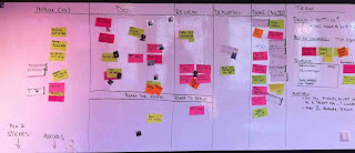
Firstly, all the stickies on the board are just in 2 colors; Reactive work and other work.
This means that you can easily take a glance at our board at any time and see what’s going on with the current distribution between reactive and proactive work.

To follow up, we did a small board on the side (with a HORRIBLE background color, sorry about that) that is updated by each person around the daily standup each morning. It simply shows where you spent your time mostly the day before.
Yes, we’re tracking days that were mostly spent in meetings too, on the yellow stickies (some people have a hard time making out the color, hence the Swedish word for yellow, GUL, written on them). Some days are swallowed up in meetings, which you can see.
UPDATE: We started to track the trends updating them weekly. Here is how it’s spread for the first couple of weeks:
It’s a rolling buffer just showing the last week. We take photos of it a little now and then to get an overview. So here you can see that during the last week, the distribution was a bit different than before.
Conclusion
With these two simple visualizations, we are gathering data on how the distribution really is between reactive and proactive work. Note the lack of exact numbers here. It’s deliberate. We hope that the pictures still give us good enough knowledge about the distribution and warn us when it goes too far in either direction.

.JPG)